
Nareeb nareeb
An elevated rebrand for a HERITAGE rich farm
A Re-Brand to elevate a highly established business into a more contemporary and sophisticated persona, that reflects their current industry prestige.
the client

Business Type
Agriculture, Livestock, Wool Industry
Project overview
Traditional - Sophisticated - Minimal - Trustworthy - recognisable - Elevated
Nareeb Nareeb wanted to obtain a fresh brand identity for their Poll Merino Sheep Stud, who have been a reliable and quality pillar of the wool industry in Australia for over 100 years.

Category
Rebrand
Services
Brand Strategy
Visual Identity
Web Design
Digital Marketing
Photography
Deliverables
Logo Suite
Stationary
Apparel
Promotional media
Website
Social Media
Email Marketing

The process
Research
Before taking on a new project clients are encouraged to provide their own unique insight into the vision for the project, and provide their suggestions for project scope. In this stage they are motivated to describe their business and values. Nareeb did just that. From there this knowledge was translated into detailed research into the target audience, business persona and visual direction.

idea generation
Nareeb’s unique business proposition and clientele required significant consideration when it came to designing their branding. As such strategies such as mind mapping were used to note constraints and opportunities for the project.
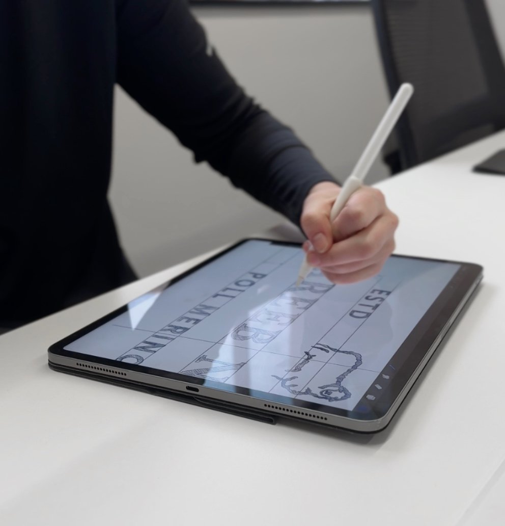
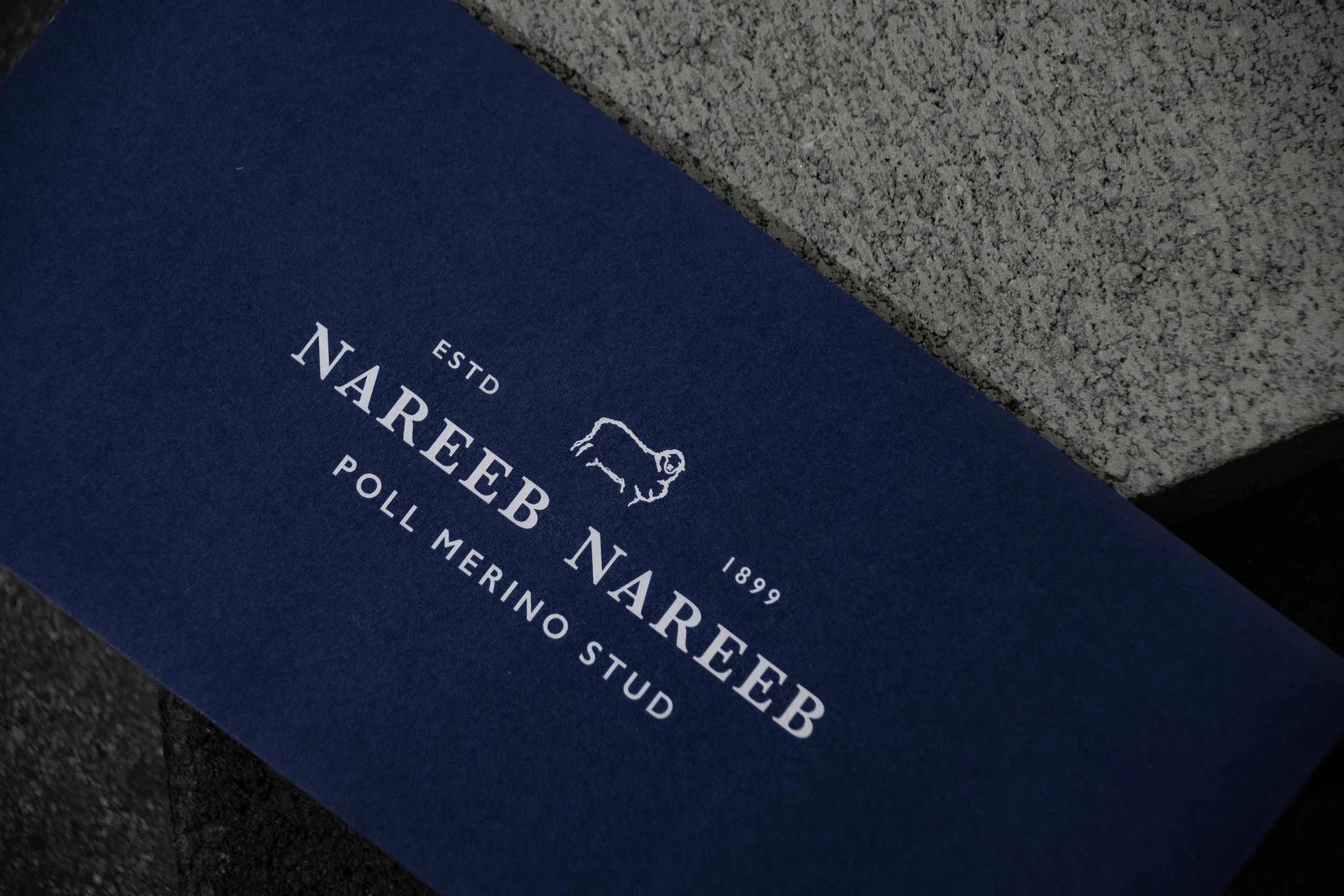
Nareeb is a family run, reliable business and and the logo needed to reflect that, hence a hand drawn icon was decidedly the most promising option, as a less refined shape allowed the visuals to feel more grounded and authentic to the brand values and persona.

Colour scheme
An updated colour scheme allows the visual identity to represent the farms growing prestige.
t elevates the overall look of the company saying this is who we were, and here is where we are today in the present.
The blue is recognisable but elevated.


Custom typography
The curated combination of Baskerville and Poppins retains that traditional feel, but is stronger and more professional. The thicker serifed characters allow the font to appear bolder, making it more readable and also allowing it stand out. And the fonts traditional feel adds to the character.
Poppins is a highly readable font, particularly in a web setting, the reason for its choice being linked to the accessibility of this.

The outcome
The Nareeb Nareeb Re-brand project resulted in a strong visual solution. The chosen colour scheme and elevated typography tie in together to create a look of prestige, highlighting the brand’s well established reputation.
The touch of personality added through the hand sketched ram motif grounds the design and emphasises their trustworthiness.


The new brand identity has been designed to suit a broad range of contexts, and hence has been applied across a wide range of stationary, apparel, packaging and print media.
The visual identity as a whole has also been used within a custom website design. This site is intentionally clear and minimal to suit the target audience of farmers. And it prioritises the communication needs, ensuring the information the readers are looking for is highly accessible.
Deliverables


Learn more about the client
To find out more about this project and about Nareeb Nareeb, visit their website or socials listed below.
